
This is the first of my Christmas commission posts and it seems strange to go back and look through Louis’ progress pictures and the snaps of where I was travelling when I painted him. It takes us back a little in my journey to the Italian Riviera which was a place I loved visiting.
Louis is the beloved pooch of my client’s boyfriend, and this was to be a big surprise for Christmas. I hope the gift has been well received and that you enjoy seeing his progress.
 Louis’ finished portrait, soft pastel 12″x12″
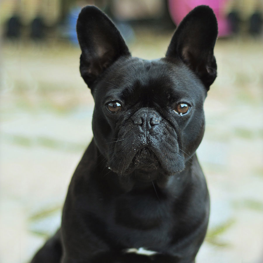 The photo reference of Louis. We decided to crop the image to just a head portrait and I also deepened the colours behind with rich olive greens to keep the focus on Louis.
 As always I begin with my line drawing sketched out onto the velour paper. I like to work from the laptop screen as I can zoom in and see all that detail.
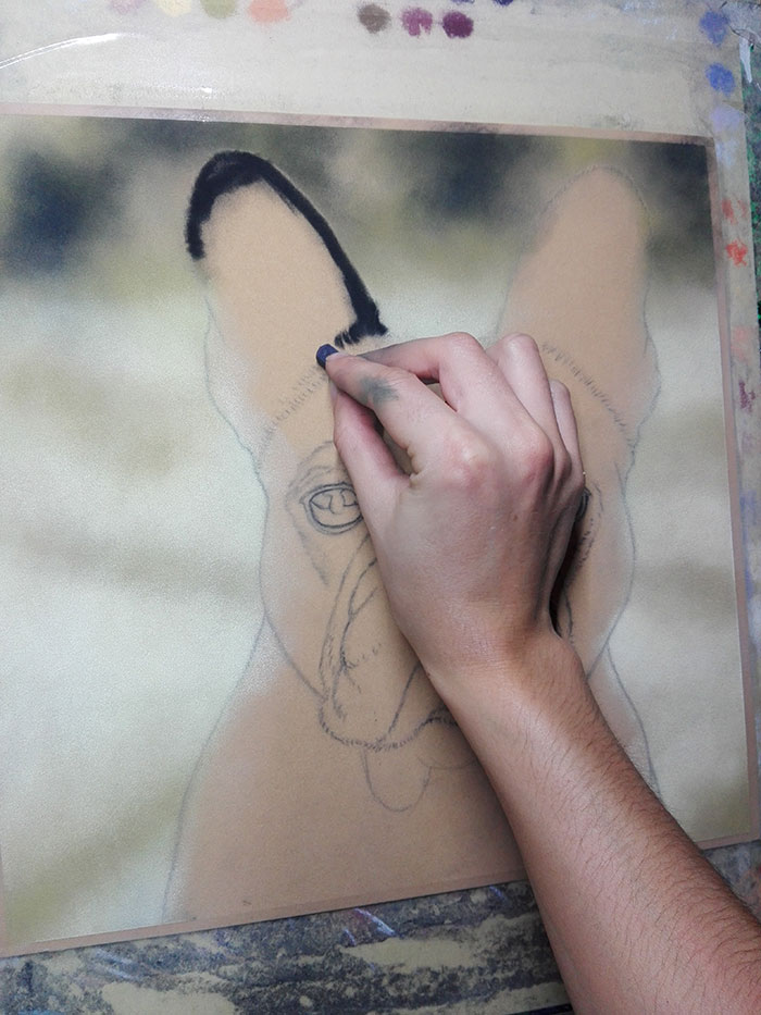 Background in using thin layers of olive greens, black and a light yellowy white from Unison called Grey27. It takes many layers before pastel will move around on velour but once it can be blended it does so in a lovely soft manner, just what pastel is great for! I tend to always start at the top right of something like this so here I am making a go for it on his ear.
 I have worked his ears here with the dark black and then the light tones inside. I actually had some other photo reference of Louis to help with some details like this. You can see my early layers starting on his face and that just requires me using a black Faber Castell stick which is a little harder than the Unison, and I block in the darkest areas. I also start to create the flow of his fine fur up and around his forehead.
 When we left Florence back in October, we headed for the Italian Riviera, planning to make it around France and into Spain before Winter sets in. This was the first place we stayed on the Riviera at San Rocco. We ended up parking here for a few days as we managed to get a great spot with this view! I thought, well if I have to work lots this month I might as well have great studio views!
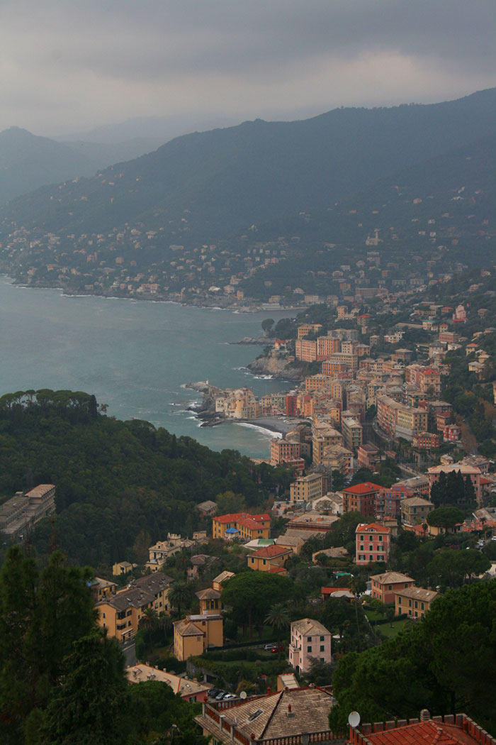 Some of the views over Camogli.
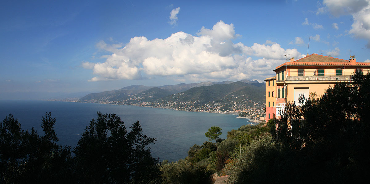 We found the Italian side of the Riviera so beautiful. All the buildings sit so perfectly into the mountainous landscape.

 After a few days of grey skies, a lovely sunny day with a perfect sunset is a great way to leave this place.
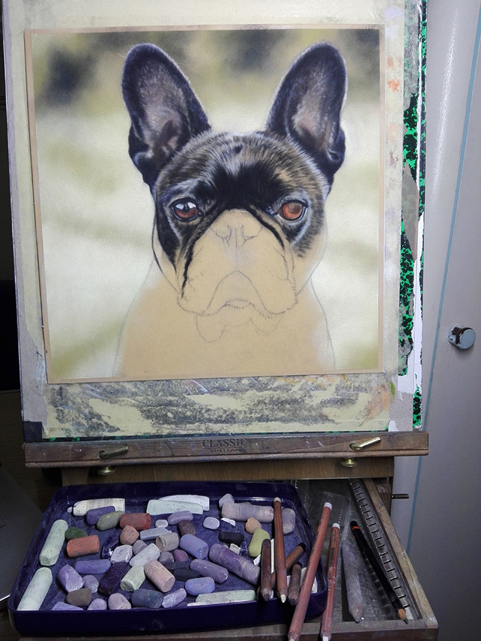 Working on Louis’ eyes now. Again I’ve been referencing other photo reference to make sure I get his eye colour lovely and rich, just how they are.
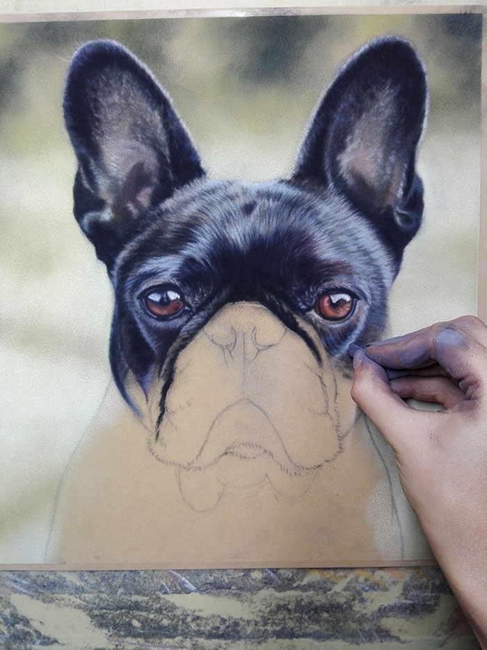 Both eyes in and I can start to work the rest of his face. Once I have it all in I will go back over, neatening and refining any hairs I can make finer. Like most smooth coated animals it takes a long time to create that effect whilst not losing the definition.
 Working on down his body and making good progress now although I know that his nose will take me a long time!
 We travelled on round the coast to a town called Celle Ligure. We have clear blue skies for a few days which makes everything so much easier in a motorhome!

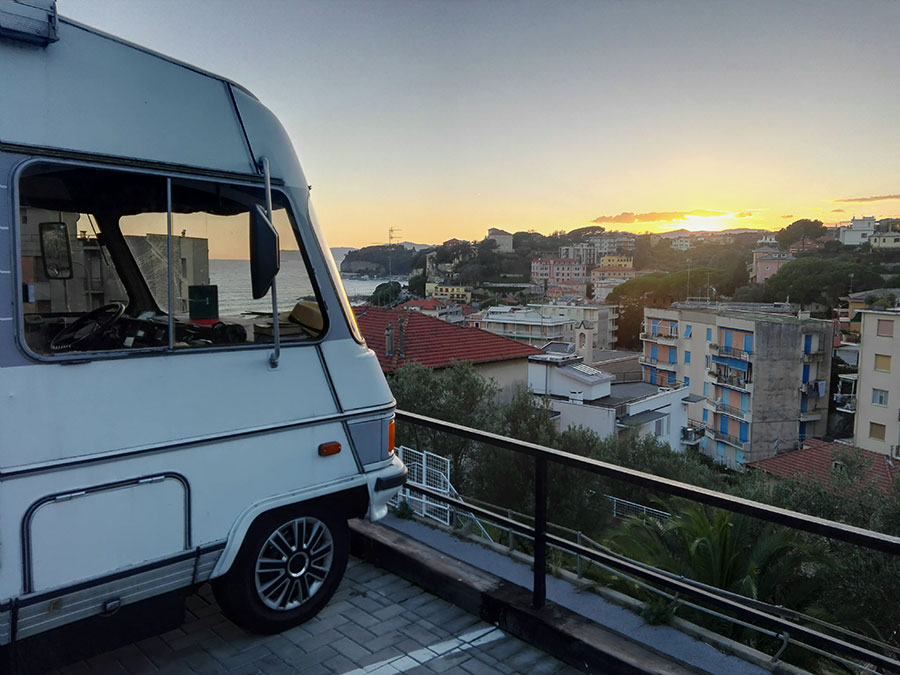 Watching the sun set with a cool view over the town. We managed to find an empty car park up on a hill for the night.
 Next morning we’re up bright and early and back to work!
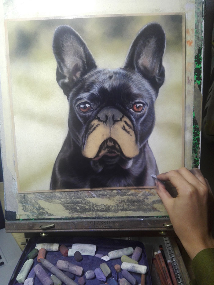 I decide to finish off Louis’ body below his chin where it is a little less detailed anyway. Also I want to have this done before his muzzle so that it sits on top of that area.
 Starting the detail on the nose area. I’ve just lighting rubbed some black over the whole area. I use some pastel pencils for the very smallest details on his nose and also to move pigment around on the paper.
 Most of my small marks are still made with the bigger soft pastels, but using broken or worn pieces. Some of my best pastels are tiny as I need their sharp edges for small detail like this.
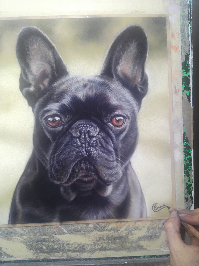 Putting my finishing touch on there. Hope you enjoyed Louis in progress!
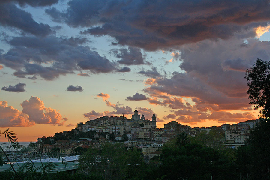 Leaving you with one final image from the Italian Riviera. Jumping out in the middle of heavy Italian traffic has never been more worth it 🙂
Please call back soon for more of my progress posts, more Christmas work to follow soon…
Gorgeous, as usual Emma! Don’t know how you are able to pay attention to painting though in such wonderful surroundings. I’m definitely looking forward to your future progress paintings.
Thank you Louise! It is very difficult sometimes to commit to working some days when the sun is out and there are so many places to see. But I do take more time off now and try to live a bit as well as paint as it’s easy to fall into the habit of doing nothing else! This lifestyle forces me out and away from the easel more!
Beautiful work. Great personality in the face and your use of pastel really amazes me!! Stunning. So very talented. Best wishes from Ireland, Patricia
Thank you Patricia for stopping by and leaving such a lovely comment! I hope you’re not too cold in Ireland, best wishes from sunny Spain 🙂
Emma always love watching your work progress. Please keep on doing them. Your amount of detail always amazes me. I am trying to use only the harder pastels for the lower layers but still sometimes find the tooth of the Pastelmat is virtually full before I have finished and then I can’t get the darkest darks with my soft ones. My art group leader says not to use black first as it’s not present in nature so to start with browns and then finish with the black on top. What do you think? Also do I start with white as a pure colour or carry on as I usually do with light pastel shades of pinky, lilac, bluey colours?? Thanks so much and keep teaching!
Hi Elaine, thanks for commenting. I agree to a certain extent with your art teacher about use of black (and white) but feel it’s more applicable to certain mediums like watercolour for example. You wouldn’t use black, but mix several colours to give you your darks. But with pastel when I want an area to be as dark as possible I lay down black first. As you’ve said, you can sometimes fill the tooth of the paper too soon. If an area needs to be dark I don’t want to have lighter colours down there to mix with and fill the tooth. Later I can come back over parts of the black with dark tones to add interest. But in almost everything I paint there is definitely an area that will be jet black. It’s kept to a minimum as is my use of pure white. But without those two values, certain paintings I’ve done would not have enough contrast. With white you’re looking at how many colours there are that are not white. Save actual white for your brightest areas where light is hitting. Hope that helps!